How to service a credit union
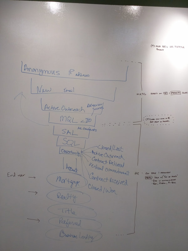
enhancing lead generation
enhancing lead generation

>> To see the client's website live today, please contact me to receive the URL.
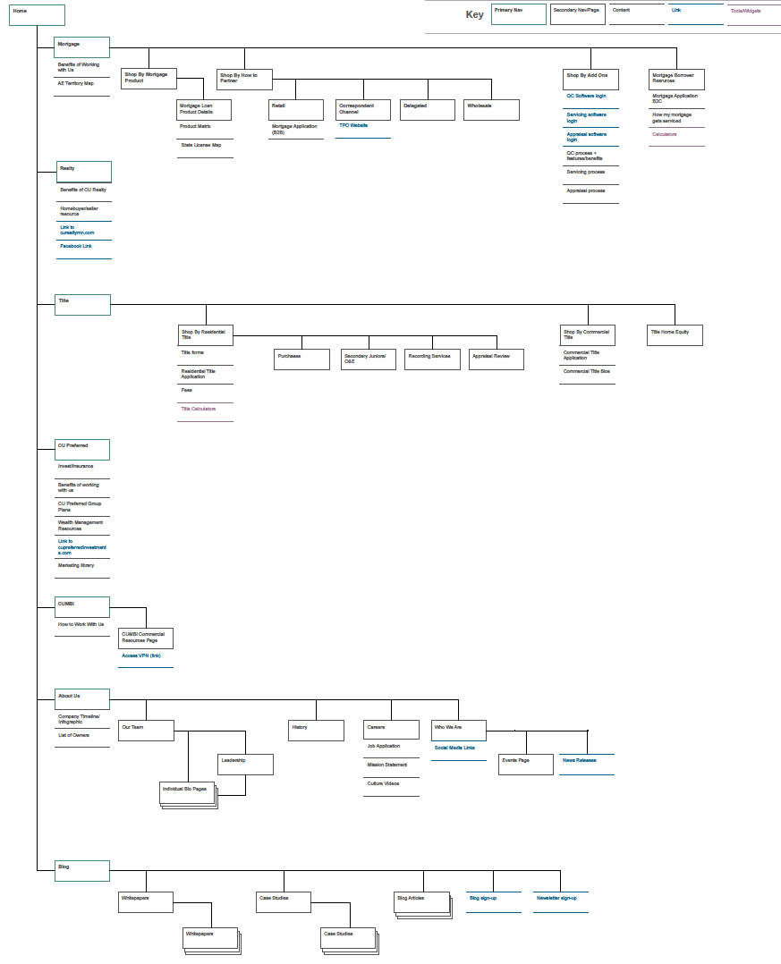
Role
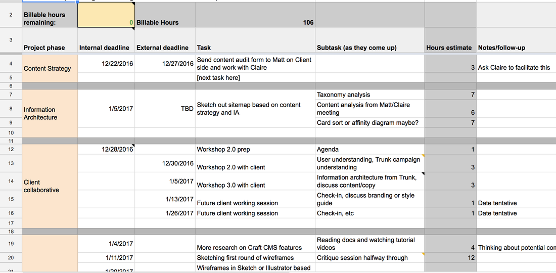
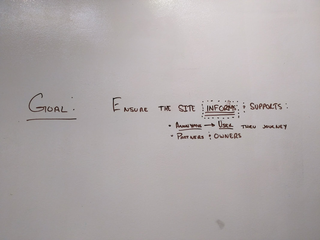
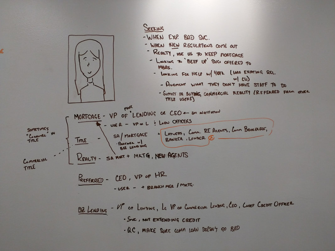
Visual + interaction designer, information architect, stakeholder workshop facilitation
Visual + interaction designer, information architect, stakeholder workshop facilitation